CA Slalom
Author
capearcona
Published
Sep 02, 2021
Item Code
cc44fdbe-3c61-4c54-b63c-2d1dd0363803
How to Download
- 1 Copy the Item Code above
- 2 Go to fuckdcma.com
- 3 Paste the code in the text box and click "Generate Download Link"
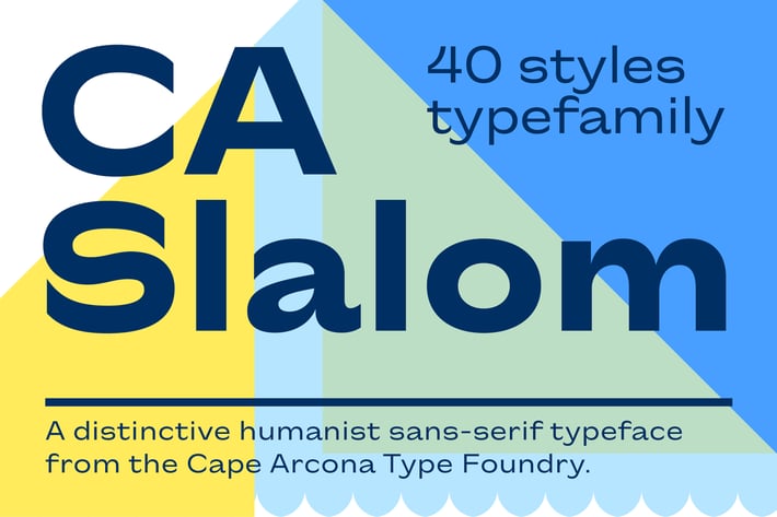
About This Item
The starting point for CA Slalom was the aspiration to create a contemporary interpretation of classics like Gill and Antique Olive in terms of aesthetics, flexibility and usefulness. The outstanding S soon became the visual hook and starting from the extra bold extended weight, CA Slalom evolved into a huge family with four widths. It’s rather round instead of squarely with stroke-ends pulled deep and a relatively low x-height. This gives CA Slalom a taste of its own, and although it is clearly contemporary, it has the potential to become a classic.