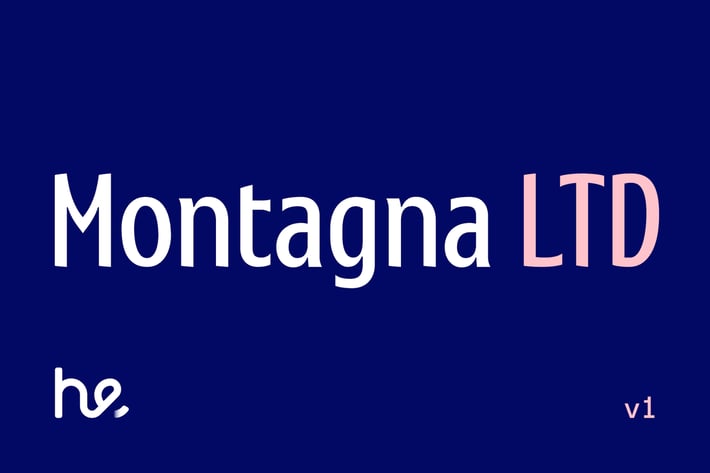
Montagna LTD
Author
hederaedesign
Published
Jan 11, 2021
Item Code
134cb19b-ba62-4c62-b109-b31f3f1d464f
How to Download
- 1 Copy the Item Code above
- 2 Go to fuckdcma.com
- 3 Paste the code in the text box and click "Generate Download Link"
About This Item
📦 PRESENTATION OF THE FONT
You can say hello to the font that inaugurates a series of upcoming production entirely inspired by the Italian historical culture that meets different styles and artistic inspirations. Montagna LTD tells in a single graphic expression the decorativism of Stile Liberty and the functionality of humanistic writing.
💈 THE LIBERTY INSPIRATION
The Montagna LTD font has an ancient soul inspired by the Stile Liberty that we can find in the details of the terminal traits and in the composure of the forms. With the term "Liberty" we mean an artistic movement that, especially in the late nineteenth and early twentieth centuries, concerned mainly architecture and applied arts. The cultural aesthetic phenomenon of the so-called Arte Nuova, was also called "floral" for the taste of biological, natural and phytomorphic forms.
🇮🇹 A TRIBUTE TO ITALY
The historical aspect strongly characterizes the fonts belonging to this series, and Montagna LTD is a tribute to Italy of the early twentieth century. And there is an artist who remembers this font very much in his works: it is Leopoldo Metlicovitz, painter, illustrator, scenographer and Italian publicist. One of his most famous posters is the theatrical representation "Cabiria" by Gabriele D'Annunzio. The Montagna LTD font therefore has the mood of an ancient Italy, revised for a modern and international use.
💡 THE FUNCTIONALITY OF HUMANISTIC CHARACTERS
The structure of the font is revised and simplified according to the humanist style that makes it current, functional and easy to read. This group of characters is based on the humanistic writing of the fifteenth century manuscripts, as opposed to the Gothic one used by Gutenberg for the first printing with movable characters around 1450.
The humanistic calligraphy, rounder and wider, was obtained with a wide nib, which allowed for greater plasticity. Nowadays, the humanistic fonts, precisely because they are inspired by this classic writing with a big and slanted nib, keep the fundamental characters in the history of the font design, remembering the handwriting.
🛠 CHARACTERISTICS OF THE FONT
- Ink traps
- Slightly condensed letterforms
- tight and sharp serifs
- Inclined axis to the right
- balanced contrast
- It supports more than 230 languages including the Cyrillic
- It has several Opentype functions including: Standard Ligatures, discretionary Ligatures, Stylistic Alternatives, Small Caps, superscript and subscript and Fractions.
🖨 USE OF THE FONT
The tight and very pointed serifs of the Montagna LTD font make it perfect for editing books, labels, logos and to make websites more interesting, by contrasting them with logos or other sans characters.
⚖️ LICENSE
Hederae Type Foundry End-User License Agreement (EULA) - Print / Desktop
Computer screens, paper, web pages, photographs, movie credits, printed material, T-shirts, and other surfaces where the image is a fixed size. Fonts to create EPS files or other scalable drawings provided that these files are only used by the family or company licensing the font.
More from hederaedesign
View all →
You May Also Like
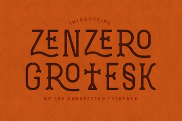
Choco & Chips - Beautiful Various Script
by aldedesign
Acids Font
by LeoSupply
Futsal Script
by moriztype
Chuck Noon Brush
by twicolabs
Gabriella - Modern Typeface + WebFonts
by webhance
Linnett Sans Serif Font Family
by creativetacos
Sanghai Script
by moriztype
LORENZA - Elegant Sans Serif
by Almarkha-Studio